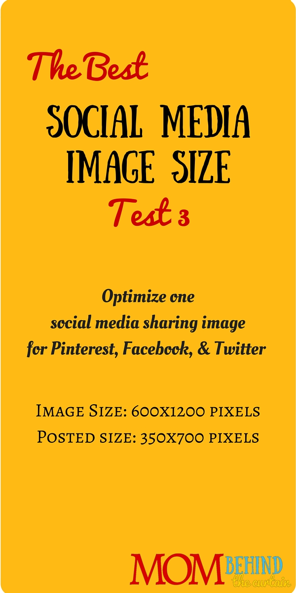
This is test 3 of trying to find the best social media image size, a single image that will work for social sharing images on Facebook, Twitter, and Pinterest.
This is a test to see how contrast affects where Facebook and Twitter crop images that are not their optimal orientation. Is it possible to create an image that will work for Pinterest, Facebook, and Twitter sharing?
This time I’m looking at whether any smart cropping is taking place, looking at contrast. Test 1 and Test 2 seemed to indicate that Facebook and Twitter were centering on the black type. So I’ll make some of the first type at the top black, and see if that changes where Facebook and Twitter crop their images.

Results: Twitter and Facebook still cropped in exactly the same place, so they may not be smart cropping, but just taking from the middle.