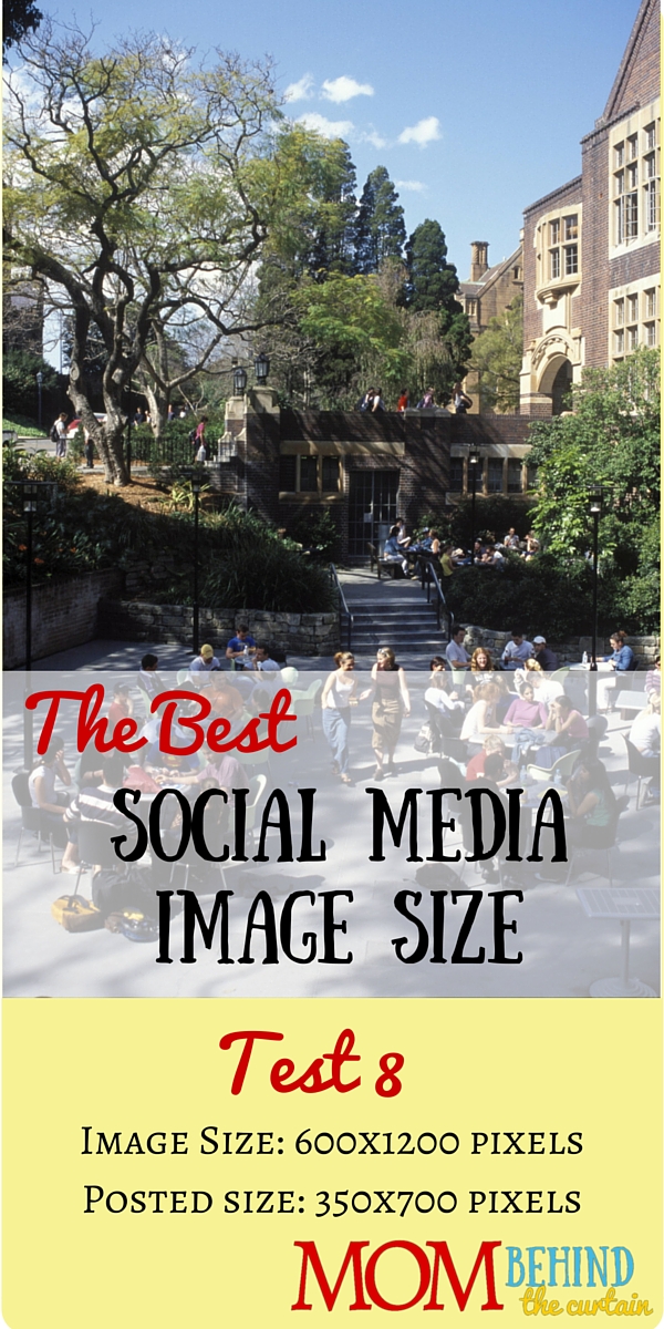
This is test 8 of trying to find the best social media image size and composition that will work for more than one social media site, a single image that will work for social sharing images on Facebook, Twitter, and Pinterest.
This is the second test to see how photos without faces affect where Facebook and Twitter crop images that are not their optimal orientation. Is it possible to create an image that will work for Pinterest, Facebook, and Twitter sharing?
This test will use a building for the photo image.

Results: When there is not a face, Facebook definitely crops from the center, and Twitter always crops from the center. Facebook uses a landscape image, wider than it is long. Originally, I thought Twitter had a smart crop and also used a landscape image. It does not have smart crop, and if the image is longer than it is wide, it uses a square image. At first I thought it might be affected by tweeting through Hootsuite, but that turned out not to matter.
Conclusion: I will need to start from the center and build outward, in the center, I need to center the photo I want to show on Facebook. I don’t think any title needs to show on Facebook.
Above and below the centered image, the image can extend and/or there can be title that will show on Twitter to the dimensions of a square.
To get the image longer for Pinterest, I will have to use an image that is big enough to expand to fill the entire area, or I’ll have to extend with more explanation/title. This might be tricky!
Wait! When I use the image from this post, both Facebook and Twitter recognize the face and center on it. What? Does it make that much difference that all the image is shorter (has different dimensions?)