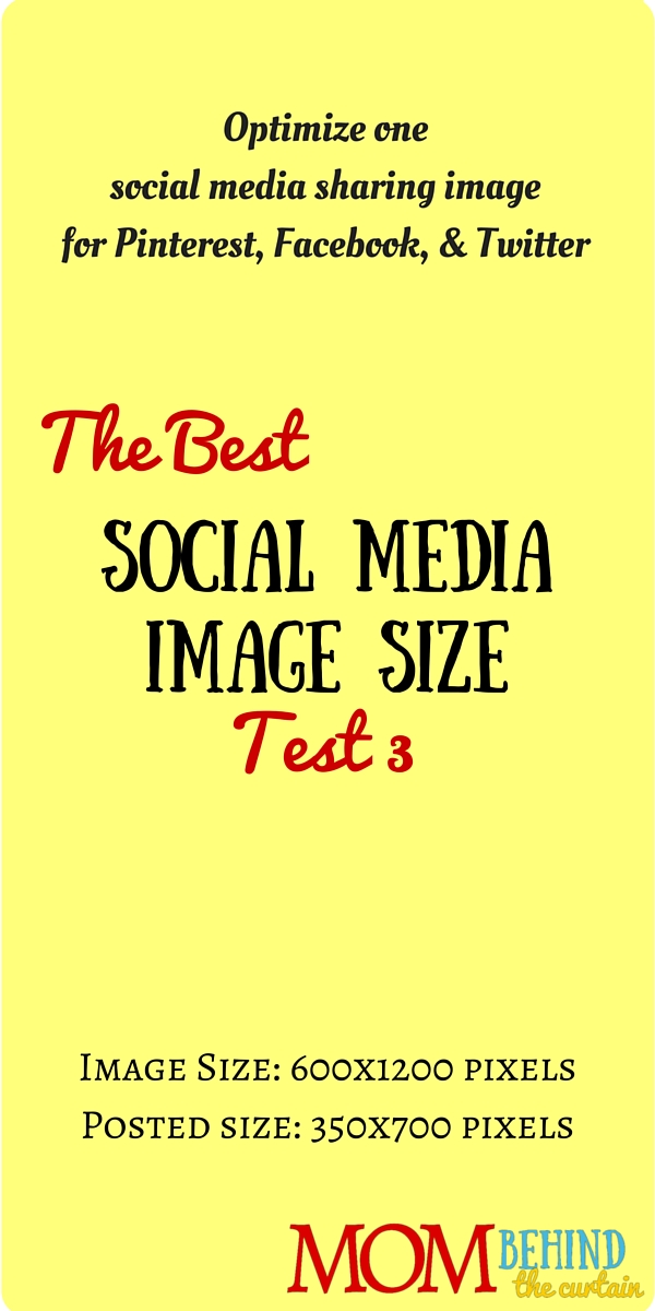
This is test 4 of trying to find the best social media image size, a single image that will work for social sharing images on Facebook, Twitter, and Pinterest.
This is a test to see how contrast affects where Facebook and Twitter crop images that are not their optimal orientation. Is it possible to create an image that will work for Pinterest, Facebook, and Twitter sharing?
One more test at looking whether or not text and text contrasts affects smart cropping. I’ll move the text around.

Results: It looks like based on text Facebook and Twitter do not crop differently. For both, this image, with no photos, just text and the headline in the center, is positioned very well for cropping on both Facebook and Twitter. Next I’ll see if it makes a difference if I add a photo across the top.